
Band score: approximately 6.0
The answer below has been rated based on the public IELTS descriptors. Click the word or words in red to see the correction, and scroll to the bottom of the page to read our comments on the report.
You should spend about 20 minutes on this task.
The chart below shows how people travelled to work in 1996 and 2001.
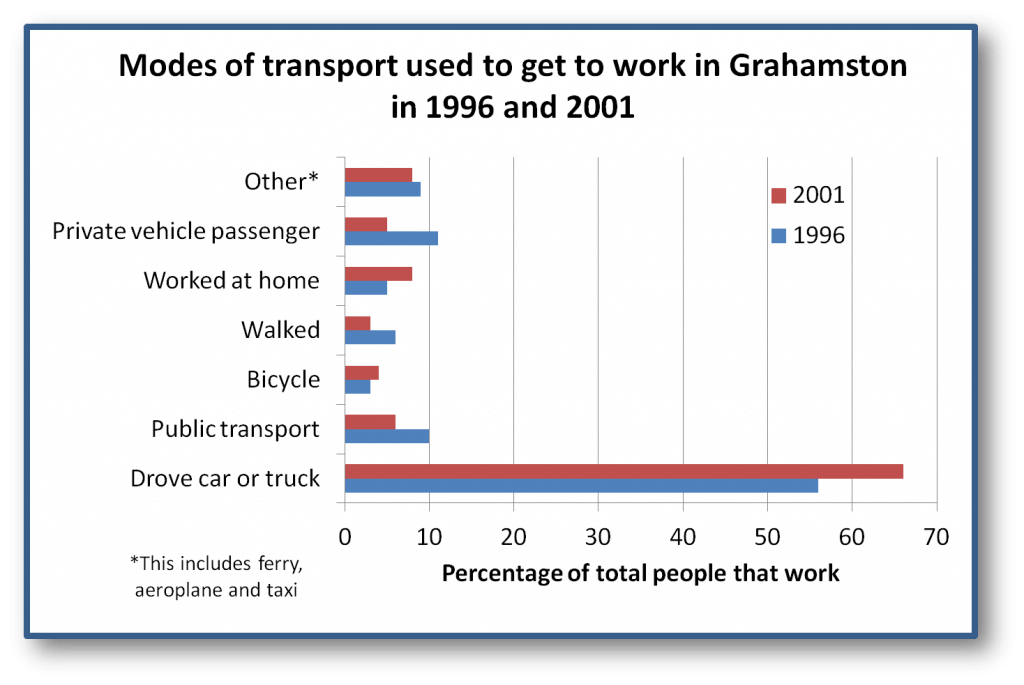
Summarise the information by selecting and reporting the main features, and make comparisons where relevant.
This chart compares how people travelled to work in year [you don’t need this – it is clear from the context – but if you do have it, then you need ‘the years…’] 1996 and 2001. Approximately 68% of people travelled by car or truck in year [you don’t need this – it is clear from the context or would need ‘the year’] 2001 as compare [‘compared’] to 1996. The least number of people travelled by walking [change this to ‘on foot’ so it fits the sentence better] in 2001 and very few travelled by bicycle in 1996.
Most people preferred [we don’t know that they preferred it, and it wasn’t most people, it was very few] working from home in year 2001 because of advanced technology in computers [this is not given in the graph so should not be included in the report] in comparison to the use of private vehicles in year 1996.
The other ways of travel was [‘were’] taxi, ferry etc. [avoid using this in your IELTS writing] in 1996 and 2001. In 2001, the order was passengers in private vehicles, public transport, bicycle and walking, while in 1996 the preferred way was public transport, others, walking, and bicycle. Although the order changed, there was not a significant difference between them over the period when compared to driving own their own vehicle.
To summarise there has been not much [‘were relatively minor’] changes in route to [‘mode of’] travel that is either by driving a car or truck in year 1996 and in 2001.
(162 words)
Comments:
Although the writer has covered the main points shown in the graph, this is only supported by one piece of data (68%). It is important to support your sentences with relevant statistics from the graph or chart.
There are also some irrelevant sections (such as using computers in the first body paragraph). Some sentences show a good use of grammar, while other sentences are less accurate.
The description of the ‘other’ category is quite repetitive, but the main points are covered in a suitable number of words, and ideas are logically arranged in paragraphs.