Academic IELTS Task 1 model answer 24 – Carbon dioxide emissions by source. This is a Band 9.0 (top score) model answer.
You should spend about 20 minutes on this task.
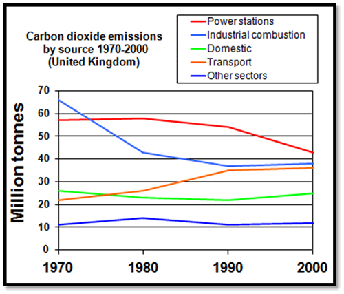
The line graph shows carbon emissions from different sources over a number of years.
Summarise the information by selecting and reporting the main features, and make comparisons where relevant.
Write at least 150 words.
The graph illustrates 5 sectors responsible for varying levels of emission of carbon dioxide in the UK over a 30 year period.
Of the given sources, industrial combustion and power stations remained the highest throughout the period given, although both declined overall, with power stations falling from a peak of just under 60 million tonnes in 1980 down to just over 40 million tonnes in 2000 and industrial combustion falling from approximately 65 million tonnes down to less than 45 million tonnes.
Both domestic production of carbon dioxide and the category labelled ‘others’ showed relatively little change over the period, beginning and ending at roughly the same level of 35 and 12 million tonnes respectively.
The only source of carbon dioxide to show a marked rise over the period came from transport, nearly doubling from just over 20 million tonnes to nearly 40.
Overall, it is evident from the graph that where some sectors declined, others remained steady and one increased in emissions over the thirty year span.
(168 words)
We hope you found Academic IELTS Task 1 model answer 24 – Carbon dioxide emissions by source useful!

