Band score: approximately 7.0
The answer below has been rated based on the public IELTS descriptors. Click the word or words in red to see the correction, and scroll to the bottom of the page to read our comments on the report.
You should spend about 20 minutes on this task.
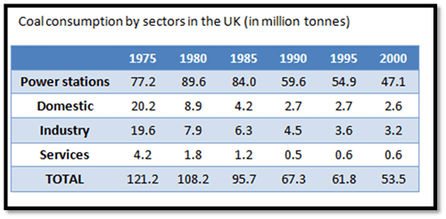
The table shows the amount of coal used by different sectors in the UK.
Summarise the information by selecting and reporting the main features, and make comparisons where relevant.
The table gives data about the quantity of coal used by 5 sectors in the UK within a period of 25 years; in addition, the level of consumption at each year the table shows the years in 5 yearly increments, not ‘each year’ is illustrated.
From 1975 to 1985, the largest amount consumed was by Power no need for a capital letter stations and Other again, no need for a capital unless it is written as the category name as ‘Other’ energy industries, whereas three the three other sectors used considerably less. To illustrate, Services either ‘the sector entitled ‘Services’ or ‘the services sector’ used 7.2 million of tonnes from 1975 to 1985, but power stations figures the figures for power stations for the same period of time were 250.8 million use a range of ways of presenting data – ‘just over 250 million’ tonnes. It was striking the fact that in 1985 Power stations used more than three quarters of the total quantity.
In the following decade from 1990 to 2000, consuming ‘consumption’ of coal decreased in all sectors. However, power stations remained still delete this word – it is redundant the highest user of coal, followed by other energy industries which utilized significantly less compared to power stations and over three times more ‘less’ than they did in 1975.
Overall, the trend of coal consumption experienced decline ‘a decline’ for all sectors with one exception in 1980 when power stations increased just under 10%. Domestic consumption levelled off in 1990 and 1995 whereas this needs to be followed by a comma other energy industries reached a plateau in 1995 and 2000.
(182 words)
Comments:
The structure of the report is logical and clear, and a description of all the main trends is included.
However, there are some errors in the data (and over three times more than they did in 1975), and some of the language used is a little informal (‘than they did’).
There are also slight errors in the use of linking words (in addition / meanwhile). In addition, the data is presented in a very specific manner – it would be better to use a range of expressions rather than simply the numbers.

